You are using an out of date browser. It may not display this or other websites correctly.
You should upgrade or use an alternative browser.
You should upgrade or use an alternative browser.
Google's new logo
- Thread starter vgane
- Start date
- Status
- Not open for further replies.
This is just the tip of the iceberg...Watch the video:
https://www.youtube.com/watch?feature=player_embedded&v=olFEpeMwgHk
https://www.youtube.com/watch?feature=player_embedded&v=olFEpeMwgHk
Google gets a new logo
September 1, 2015 Kishore Ganesh Leave a comment Edit
Google is a company that is synonymous with the Internet. It was born in the early days of the Internet, and grew with it. Google is the Internet. Not a day goes by without us using the search engine.
Of course now, Google has diversified into mobile OS platforms, hardware, software services and more, and to improve the pace of development, the search engine remained Google and with the exception of a few services, the other parts of Google spun off into their own companies, all governed by a larger company named Alphabet.
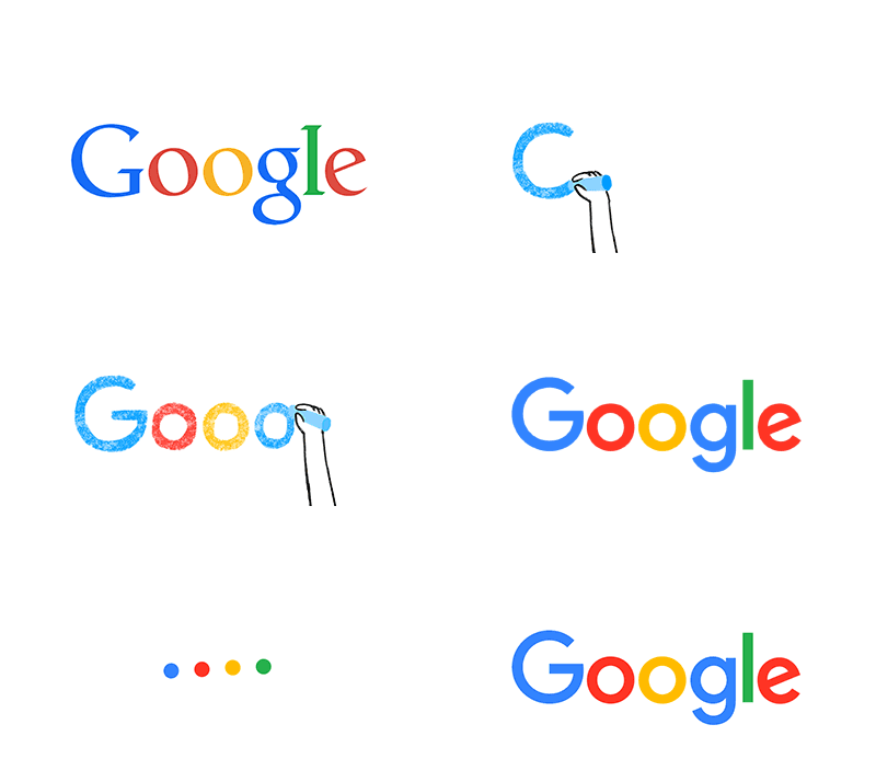
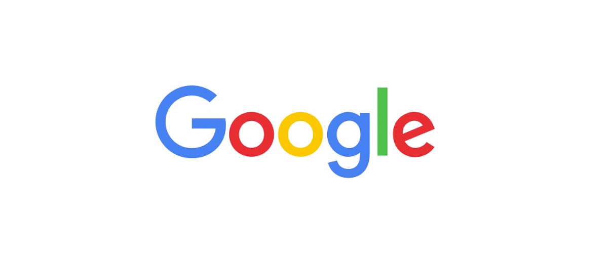
Google is now a subsidiary of Alphabet. And in light of this new next phase in Google’s evolution, Google’s logo has been changed. Google’s logo has pretty much remained the same for the past decade, with flatter design and color changes being the only notable things.
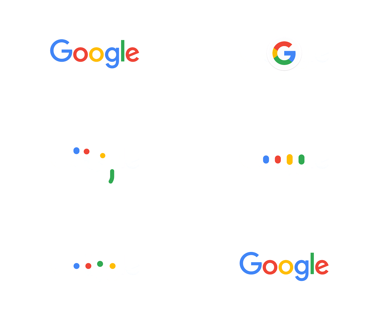
Now, Google is introducing a new logo that is actually quite different. Google has changed the font and has made it more playful. Actually, it is in line with the font that is used for Alphabet’s logo.
Google even has something for the designers among us: Detailed reasoning behind the new logo. One of the reasons is supposedly because these load much faster on mobile devices (Due to the much smaller size of images)
What do you think? Do you like Google’s new logo?
September 1, 2015 Kishore Ganesh Leave a comment Edit

Google is a company that is synonymous with the Internet. It was born in the early days of the Internet, and grew with it. Google is the Internet. Not a day goes by without us using the search engine.
Of course now, Google has diversified into mobile OS platforms, hardware, software services and more, and to improve the pace of development, the search engine remained Google and with the exception of a few services, the other parts of Google spun off into their own companies, all governed by a larger company named Alphabet.

Google is now a subsidiary of Alphabet. And in light of this new next phase in Google’s evolution, Google’s logo has been changed. Google’s logo has pretty much remained the same for the past decade, with flatter design and color changes being the only notable things.
Google even has something for the designers among us: Detailed reasoning behind the new logo. One of the reasons is supposedly because these load much faster on mobile devices (Due to the much smaller size of images)
What do you think? Do you like Google’s new logo?
- Status
- Not open for further replies.
Similar threads
- Replies
- 12
- Views
- 3K
- Replies
- 1
- Views
- 1K
- Replies
- 2
- Views
- 1K
- Replies
- 11
- Views
- 6K

